


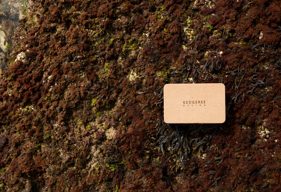
Naming the Brand!
Naming the brand Kedgeree was a bit of a gamble. It ran the risk of people mistaking it for a food-related brand, or worse, simply not being able to remember the obscure word. But it was the perfect fit- a product of both Indian and British origins- after which, no matter how many other names we bounced around, our heart returned to Kedgeree.
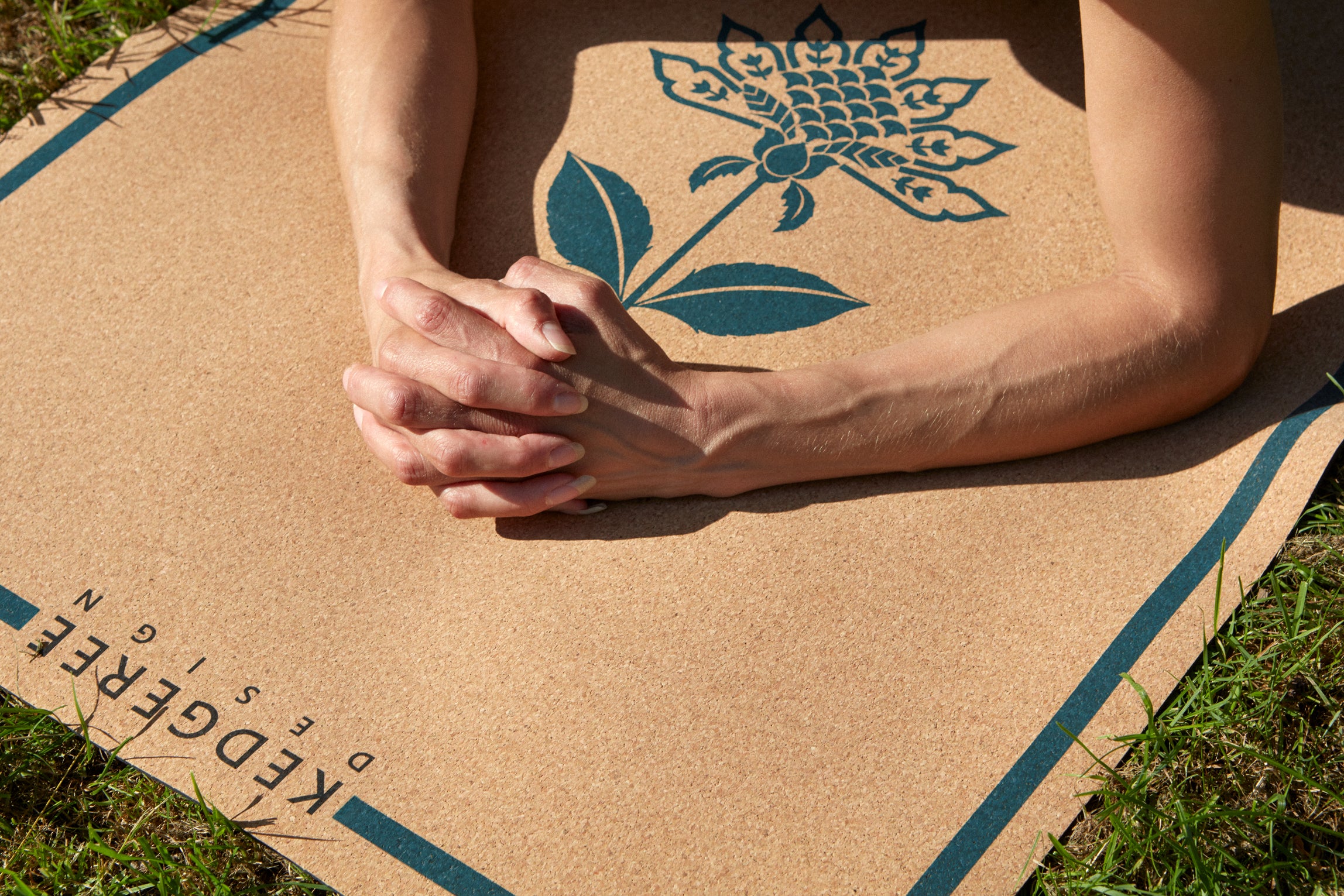
Our design philosophy also largely emanates from this one point- taking something inherently Indian and infusing it with the subtlety and elegance of British aesthetics. Our artists constantly draw from an extensive cultural and historical ecosystem to come up with motifs and designs that are at once unique, and an ode to the two cultures.
Understated luxury is built into the creation of each of these designs, keeping in mind that they stand the test of passing trends, and changing fads. The process of creating and refining the designs while still keeping it rooted in the Dabu printing tradition was my favourite part. The idea was to build sleek British aesthetics into something inherently Indian- the wooden block Dabu print. It was a long but gratifying process of trial and error that culminated in three distinctly individualistic mats.
The motive to create these lines of products emanated from an inquiry into why yoga mats come in such unnatural shades accompanied by artificial dyes and materials that are harsh on the skin.
I’ve always found the loud, jarring colours of most yoga mats to be obtrusive to the sanctity of meditation. Our mats employ earthy tones with complimentary shades of indigo, moss green, and brown to ensure that the mat will never be an eyesore or a hindrance to your mindfulness ritual.
Each of these premium mats is created keeping in mind that people are constantly looking for a source to ground themselves. Each of the mats is imagined to highlight a particular aspect of the human aura. To know more about the mats, check them out below!

Leave a comment
This site is protected by hCaptcha and the hCaptcha Privacy Policy and Terms of Service apply.